Product Detail page
I proposed and designed a unified template applied to every piece of content catalogued by Roku, aligning functionality across multiple product and engineering teams. This template supports every known TV show or movie that can be streamed, and every playback and payment interaction offered by Roku. Initial AB tests project an annual revenue boost of 8.22% or $62M (based on the previous year’s subscription and streaming ad revenue of $761M).

Role
Proposed project → Design Lead → Design System / Producer → Small time graphics engineer
Overview
Having to adapt to evolving business models in a nascent streaming market had created significant technical debt for Roku. For example the exact same show/movie could be represented by FOUR different page templates depending how it was accessed and which business model it supported.

With everything looking almost the same, but functionally different, this experience was known to be extremely disorienting to users.
Each page had been created by a different business unit, and each of them in turn were self sustaining and doing just fine, which (unfortunately) meant no one was willing to fix it, despite the resource drain of maintaining 4 templates. So I approached our Eng SVP and proposed designing a new unified template. I iterated slowly (I still had a day job launching OS Search) aligning functionality across five different product/engineering teams. Over the next year the project gained enough buy in to be approved for development.
Process
feature audit
I started by auditing the four different pages with four different feature sets that needed to be combined into a single unified page template:

Choosing a layout
Once I had stopped sweating at the prospect of having to support all these flows :D I began drawing dozens of layout variants that created dedicated space for new features such as pivots, page level actions and season browsing.

The page had to be able to support good/bad metadata, few/many providers and actions, seasons browsing, continue watching data; the list went on. Trying to thread the needle between all these use cases and stakeholders was a long and painstaking process.
MOTION STUDY
I refined and collected feedback through many reviews and user testing, until we collectively felt we had reduced our options to the most flexible but simple layout that accommodated all existing features (plus a few more we had been hoping to build). I assembled the winning designs into a motion demo that was circulated amongst relevant teams for buy in:
EXECUTION
UI Specification
Once we had agreed to a favored layout I specified how all the features would fit into it.


Product Title - Can be imagery or text
Art area - Can use immersive BG imagery OR box art
Text metadata - Two lines of metadata + 3 lines of text description
Page actions - Actions that apply to the content itself
Pay/Play actions - Actions associated with a particular streaming service.
Pivot browsing - A major new addition, these rows allow the user to pivot to other titles related to the first title (i.e. More Like This, Cast/Crew)
SIMPLIFYING STREAMING INDUSTRY COMPLEXITY
The streaming business is vast and complex; the same piece of content can be rented, bought, free w/ads, free w/subscription, airing live, airing later, etc. I mapped dozens of intersecting use cases to two rows of buttons; the “Pay/Play” row and the “Content Action” row.
The “Play/Pay” row supports user flows ranging from:
Playback of every kind of content, whether bingeing through a TV series, catching a live game, or watching a trailer for a movie.
Starting subscriptions to Roku Pay supported services like Disney, HBO, Paramount Plus
“Deep Linking” users to existing subscription content (e.g. Netflix or Hulu)
Purchase / Rental of VOD content
Installing apps, Roku themes, screensavers and more.
The Actions/Overflow row supports actions like Browsing Seasons and Episodes and Saving content, as well as any secondary actions like uninstalling or removing from Continue Watching.
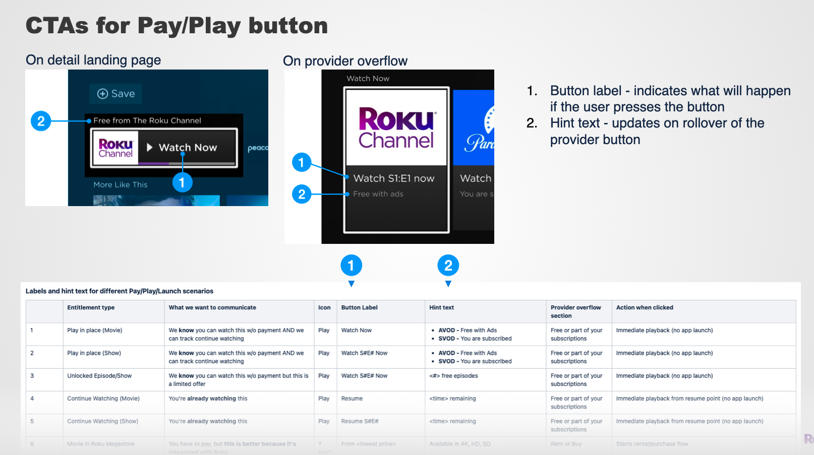
This single button design and interaction table grew to support the nearly 40 (!) possible ways that the user might have access to a piece of content, including live events, app installs, bookmarked content, and Roku hosted vs partner hosted content. It did this across every method of entitlement supported by Roku, e.g. free Ad supported, subscription required, or buy/rent.
Technical constraint - not our metadata
Our metadata was an inconsistent mix of Gracenote and partner-supplied art. Building this screen for Roku presented unique challenges:
Size and diversity of library - We index EVERYTHING, over 15M pieces of content compared to the typical 1~15K you might find on Neftlix or Disney Plus. Every episode of every TV Show, every movie ever released, sporting events, apps, actors, and user generated content; this layout needed to be flexible to support whatever kind of metadata we might encounter.
Unpredictable metadata quality - Due to the the size of our library we did not have resources to hand curate / QA every title the way Disney + or HBO might.
Roku vs Partner branding - We had the responsibility of showcasing every streaming provider the user may subscribe to, and Roku’s own ad-supported content, while still conveying to the user that they are using a Roku product.

The with so many possible use cases and wide range of metadata quality, the permutations of possible layouts within the system were significant.
I demonstrated an approach that scaled to every possible type of visual metadata and branding need we could think of, and stress tested this approach against real-world metadata applied across a range of content types.
Pixel perfect layout for EVERY market
I provided pixel-level measurements for every UI element and text string, including methods to scale long CTAs to international UI copy.

Design systems
I created a system of Figma components and layouts used by four other project teams (Sports, News, App Store, Roku Themes). This allowed us all to stay completely in sync with regards to ongoing changes to the template.
Image compositing service
I joined our engineers in implementing layouts needed for every possible fallback state and pivot screen, using a background image service using thumbor (an open source image compositing API). This method allows us the greatest flexibility in modifying the background to accommodate rapidly changing content needs unique to such a large platform (such as partner branding needs or fixing poor quality metadata). My layouts were used to dynamically generate several million content assets, and can be updated on the fly as new imagery is ingested from content partners.

Final product
After 9 months of myself and my PM leading nearly a dozen engineers, data scientists, and QA, we had refactored all the legacy code and every possible transaction supported by the old pages and were ready to test.

AB Test and release
The product details page was AB tested and optimized extensively prior to worldwide roll out in June 2023. It is the most critical piece of Roku’s strategy to increase usage of Roku UI (vs always launching partner apps). Some metrics from the study:
Increased free trial starts by 8.78%
Increased Roku Pay conversions by 5.67%
Reduced passive cancellation by 8.66% (likely due to better integration of Continue Watching)
Projected annual revenue boost of 8.22% or $62M, mostly from subscriptions managed by Roku Pay
Next steps
Now that the basic design framework has been established, Roku will continue AB testing and evaluating different combinations of features and releasing as winners are identified. These include:
Ratings - e.g. Rotten Tomatos, User generated (released in Sept 2023)
Related content - beyond “More Like This”, what other types of content can we provide here? (released Sept 2023)
Trailer/teaser integration - Because we index EVERYTHING and from multiple providers, a video teaser may not always be available or appropriate to play.
Custom Branding and Art - Some titles (such as a Disney Exclusive) lend themselves to heavy branding from our partners, whereas some old movies or short form may not even have a logo asset available. How can we open up our design system to let partners showcase their brand while still feeling like consistent a Roku product?