DIY fridge display
Part of my role at the Visual Display UX Lab was to design new applications for displays within the home. Much of our time was spent pondering the practicality of different interactions and creating experiential prototypes to test them. At the time we focused on finding applications for voice and gesture on large screens, as these technologies were featured in the TV... but I sometimes felt we overlooked simple solutions in favor of technically sophisticated ones. So in my spare time at home I decided to do some pro-bono R&D.
Goal
- Identify potential usability advantages that can be gained from simple differences in form and placement of existing products.
Role
Sole prototyper, researcher, and magnetizer/tape dispenser operator.
Results
- Validated some of the core use cases for a non-TV display in the home.
- Contributed designs and inspiration to Samsung's Family Hub.
PROCESS
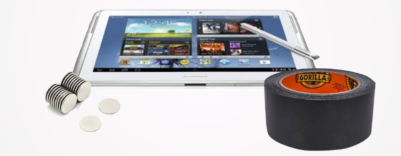
In 2012 Samsung gave us free tablets as a holiday gift. Generous as it was, I planned on re-gifting mine; we already had two iPads and didn't need another tablet kicking around. However as part of a white elephant gift exchange I also got a roll of neodymium magnets, and I decided put them together to run a design experiment at home.
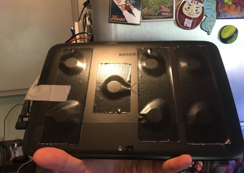
The magnets were strong and the duct tape provided friction to prevent it from sliding down. I could stick the tablet to nails in drywall and the steel door next to my garage workbench. But I had watched enough user research sessions to know that it should go in my kitchen, probably as a magnet on my refrigerator.
I gave it a permanent charging hookup and found some decent PC speakers in my garage, and attempted to conceal the cables for an experiment I imagined lasting 2-3 days max.
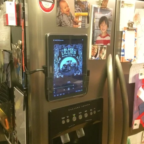
After several weeks of use
To my surprise, my over-engineered refrigerator magnet became the most frequently used tablet in the house. Being able to play music/podcasts/audiobooks, check our family calendar, pull up recipes, see the baby monitor, and just look stuff up was supremely convenient; ever so-slightly faster than pulling out a phone. When hands-free "Ok Google" came about, kitchen timers changed our cooking game.
We attributed its unexpected utility to simple but powerful ergonomic advantages:
- Permanence - It was always present and ready to use, never charging in the bedroom or lost in the couch.
- Android - App widgets turned out to be a critical differentiator; they were like small virtual fridge magnets in this form factor, allowing us to create a control panel of only stuff we needed. IMO this experiment would not have worked with iOS.
- Sound quality - The non-bluetooth speakers sounded great, never wandered off, never needed charging or pairing.
- Placement - The large screen was centrally positioned in our kitchen triangle but took up zero counter space.
- Voice - Hands free voice control for simple things like starting music or timers was a massive leap in usability, especially in a kitchen where ergonomics are critical.
I documented my proof of concept and shared my learnings with our team, where it continued to inspire a number of "non-TV" display R&D projects. It was a foundational experiment that inspired much of my later work on voice UX and remains a permanent fixture in our kitchen today.
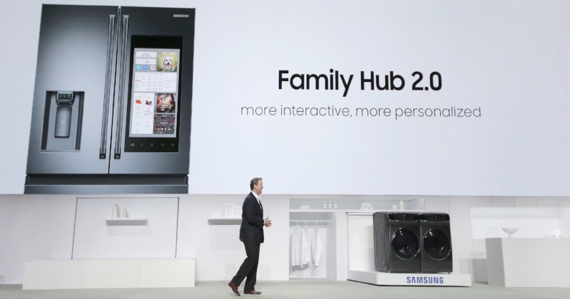
Involvement in Family Hub
Four years later our lab productized a similar concept called Family Hub. Family Hub was the product of collaboration between many different labs, with its own positioning, use cases, and form factor. My previous work in Out of Box experiences and vertically mounted displays obviously intersected with their vision. I was asked to aid in the design effort as a usability consultant, eventually designing the first Tizen profile and personalization system.
Personalization was (and still is) a unique challenge for a shared device. Our system needed to accommodate calendars and to-do lists for entire families in a multi-user environment. Our stakeholders had identified specific product design goals that drove the design:
- Fast - Defining profiles for your whole family should be fast enough to happen during setup.
- Self contained - Avoid asking for real avatar images or social network logins for children (users strongly rejected downloading apps as part of setup)
- Glanceable - Notifications and other personalized items should be visible from a distance.
- Abstract but Personal - More personal than the standard pictures of soccer balls and butterflies that are common to multi-user OS design.
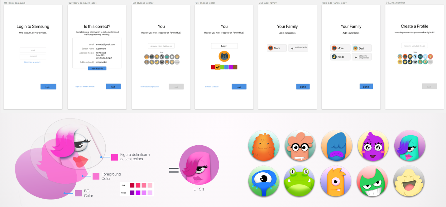
My initial Sketch file for profiles and personalization. Working with our illustrator we devised a way to use colors and characters interchangeably, making a scannable color-coded system for organizing family calendars, to-do lists, and messages. (Avatar Illustrations by Kyle McGill)
Family Hub is the first Samsung product to include voice ID, which will make extensive use of this profile system, particularly for families with children who often use voice commands. Family Hub remains a key part of Samsung's strategy in the home. Best of all, my gift tablet from 5 years ago is still kicking!
Press