Samsung Tizen v1
I defined the primary interactions and design templates used by the to specify every interaction in v1 of Samsung’s Tizen TV OS. As the margin for hardware sales dwindles, these page templates remain the backbone of Samsung’s $1B/year streaming business via their TVPlus and Gaming offerings.
Goals
Define a more "TV Like" design to the Samsung TV Smart Hub.
Enable the Korean team to be more agile, designing a scalable multi-year platform rather than an expensive one-off solution every year.
Role
Interaction Design - Contributed many designs and helped our leadership define future product strategy to the Smart TV business.
New Projects Lead - Initiated and led successful supporting efforts helping us gain credibility as a lab and increase our involvement in the yearly shipping product lineup.
Result
Delivered UI frameworks and interaction patterns used in the 2013/14/15/16 Tizen TVs.
Helped establish our lab as leaders in TV design.
PROCESS

Samsung 2012 Smart TV. Only five out of 20 pre-loaded Apps had anything to do with popular streaming video content. This design was an (almost) direct port of the the Galaxy S3 home screen.
In 2012 I joined the newly formed Samsung Visual Displays UX R&D team. As a newly minted R&D lab, our directive for the year was to demonstrate design thinking to the shipping product team in Korea, bring best practices in agile software design and development to the team, and establish a pipeline for our UX R&D efforts to make their way to product.
Our goal was simple; since streaming video was going head to head with traditional set-top-box viewing, streaming video content and Apps should be front and center in the smart tv UI. Unfortunately the product team had already devoted most of the UI to failed attempts at establishing new social networking systems.
With its use of mobile iconography and pre-loaded social networking apps that did nothing more than display your feed on TV, the existing design was undoubtedly “mobile like”… but when it came to being “TV like”, it was up to us to define what that meant.
Exploration

In my role I made countless rudimentary motion prototypes during a workshop to help communicate our concepts more clearly. With all the different rollover states, scrolling patterns, overlay techniques etc, this really helped communicate how a user would navigate through the interface.
We spent several months brainstorming, prototyping, and user testing different home/hub patterns to crystallize what we thought of as a “TV Like” interface. Through extensive research and iteration, we all agreed on a set of design principles for TV interfaces:
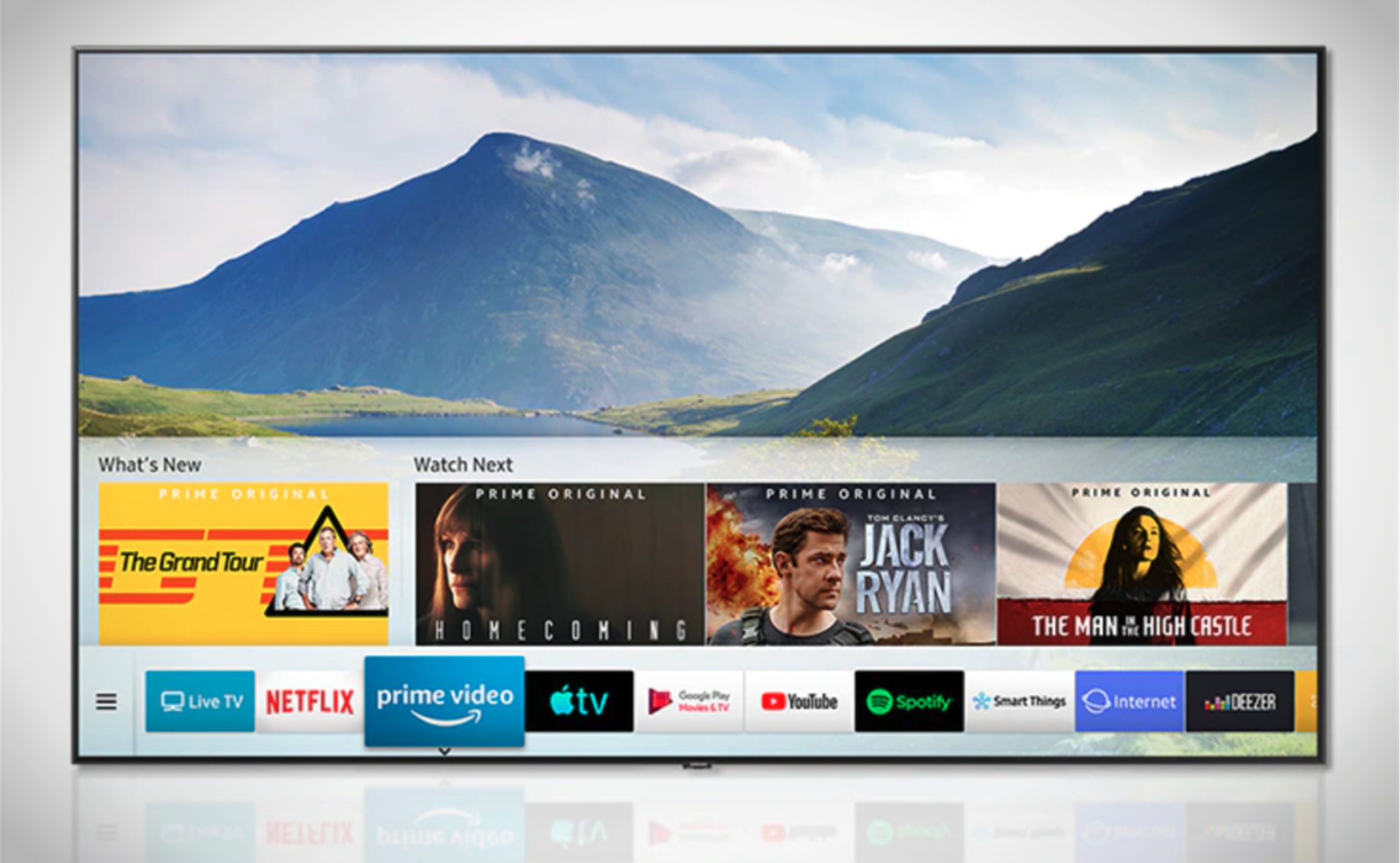
Live TV as home - We chose to make the lowest z-layer of the UI be live video from the currently selected source. This seemingly small tweak had significant effects on the user’s mental model; this was a TV first and a computer second.
Lower third design - The lower third is a ubiquitous broadcast TV design element. Turning it into a UI element would allow the user to dip their toe into the world of apps and services while keeping a foot in whatever they were currently watching.
After frequent flights to Korea and many long discussions about what TV viewers want, our work and method came to be championed by the Korean director of TV design (who later moved to the US to join our lab as it took control of the 2016 TV). From 2013-14 a team consisting of our VP + four designers worked directly with the shipping product team to bring our work to life as the first Tizen TV. During this time we introduced the HQ designers to the world of UI frameworks and reusable components.
Definition
I defined the “Keyscreen” UI spec, which was the first ever UI component and tool kit for the design team, defining a framework of reusable layouts and components that allowed designers to build around a common set of patterns:

These UI patterns were put to use by myself and a team of ~30 designers defining every interaction in the Tizen OS, from the “lower third” launch menu to a variety of content browsing sections, photo/video/music browsing, and a massive overhaul of the TV App store.

There were significant political and business obstacles to implementing V1 of our design. We certainly didn’t get everything we wanted; many compromises had to be made. Most notably the first version of the home screen we wanted required content deals and API access that could not be secured in time; but the basic interaction framework I defined has stood the test of time, and I was gratified to see my work on the show floor at CES year after year. These was a formative period for our lab, crucial to establishing credibility in our approach to software design.

This work has since been built upon heavily by re-skinning it and adding new UI components like carousels and shelves. Most of the content browsing screens remained untouched for several years, and many of the interaction patterns are still being followed today. This component-based approach allowed the product team to focus their attention on things like re-inventing the home screen of the TV and fixing the remote.
Press